Wondering how to make your kitchen look more expensive? If your current kitchen leaves you pining for that high-end designer look, you’ve come to the right place.
I have poured over many thousands of interior designer pictures over the years, and I’ve noticed a constant pattern with nearly all of them.
When it comes to the kitchen, the heart of the home, there are 12 main ingredients in the “expensive designer” potion.
So if you’re ready to give your current kitchen a big designer-approved upgrade, take note of the following tips and tricks.
Here are the 12 designer tips that will make your kitchen look more expensive!
Designer Tip 1: Layers Of Texture
Kitchens (especially the ever-so-popular all white kitchens) can sometimes be left feeling cold, sterile and strictly utilitarian. To keep your kitchen from leaving you chilly and bored, be sure to add plenty of visual and tangible texture.
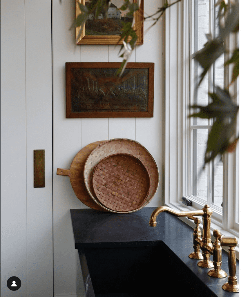
A few great ways to add layers of texture are baskets, wooden cutting boards, a rug, brass accents, concrete vase, woven bamboo window shades, etc.
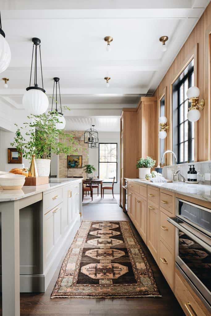
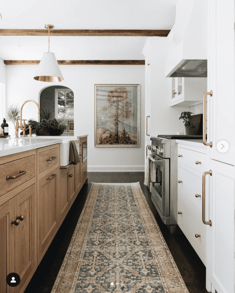
In the above photo, the kitchen designer queen herself, Jean Stoffer has brilliantly displayed how layers of texture bring so much warmth and interest to the kitchen.
From the rug runner on the floor (notice how it’s not just a small mat beneath the sink) to decor items of shiny brass and rough concrete on the island, this kitchen has so many great layers of texture!
How you can add layers of texture to your kitchen:
Think of the way things feel to the touch – rough, smooth, cold. And think of the way they look to the eye – shiny, matte, warm colors, cool colors. You’ll want a nice mixture of contrasting textures.
For example, a collection of wooden cutting boards paired with a shiny silver champagne bucket that holds a potted fern. Or perhaps a fat, textured concrete planter for foliage pared with chunky basket weaved tray. The options are endless!
SHOP IDEAS FOR ADDING LAYERS OF TEXTURE TO MAKE YOUR KITCHEN LOOK MORE EXPENSIVE
Designer Tip 2: Clear Counters
You know what you won’t see on the counters of a kitchen that’s been designed, decorated or staged by a designer?
A toaster, a blender, a Ninja Bullet, a juicer, a countertop microwave, a toaster oven, a brightly colored Keurig, a Food Saver, a food processor, an air frier, a Fry Daddy, an Instapot….ok you get the idea.
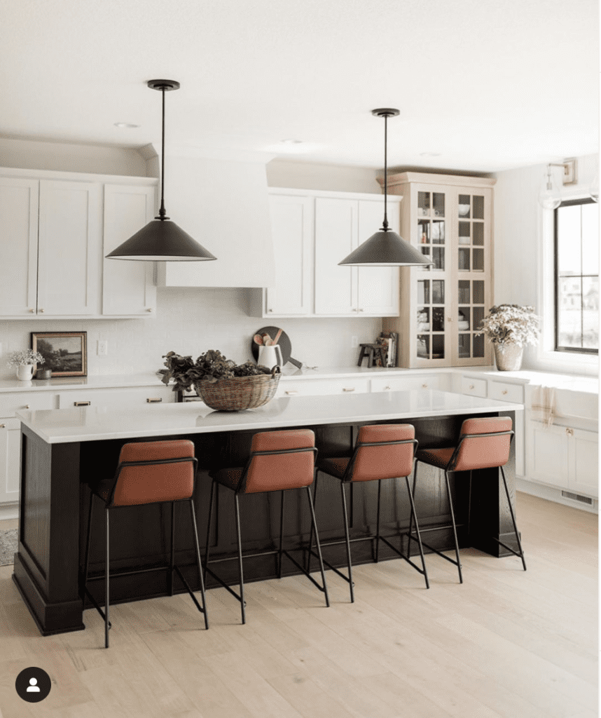
The beautiful kitchens above, by Oak Stone Homes and Kitchen Lab Interiors, show off how stunning and sharp a kitchen can be by having nary a small kitchen appliance in sight.
How you can clear the counters in your kitchen:
I realize that some of us use some of these items on a daily basis…BUT, if you want your kitchen to have that expensive designer look, you must put these items behind closed cupboard doors!
If you have any (or all) of these items on your countertops at the moment, I’d like to challenge you to remove as many of them as you possibly can. Ok, ok you can keep the microwave on the counter…but only if you truly have no where else to hide it!!
I know you might be saying to yourself, “there’s no way I can remove everything, I need my stuff. You’re crazy!”
Just trust me on this one.
After reading this post, go into your kitchen and take EVERYTHING off the counters. I’m talking everything. Mail, medication bottles, dishes, appliances, charging cables, kids crafting supplies, EVERYTHING.
Then only put back what you absolutely have to. Find a place behind closed doors for everything else you don’t need to use in the next 12 hours. Find a new permanent home for basically everything else.
Oh, and clear off the fridge too! No magnets, no art, nothing on the fridge – proudly display those items elsewhere.
We’re making the kitchen look more expensive, remember?!
Do these things, then tell me your kitchen doesn’t look better!
Designer Tip 3: Decant Everything
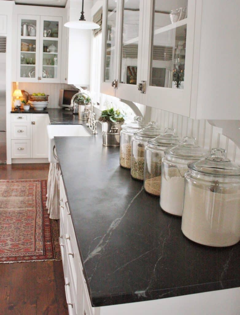
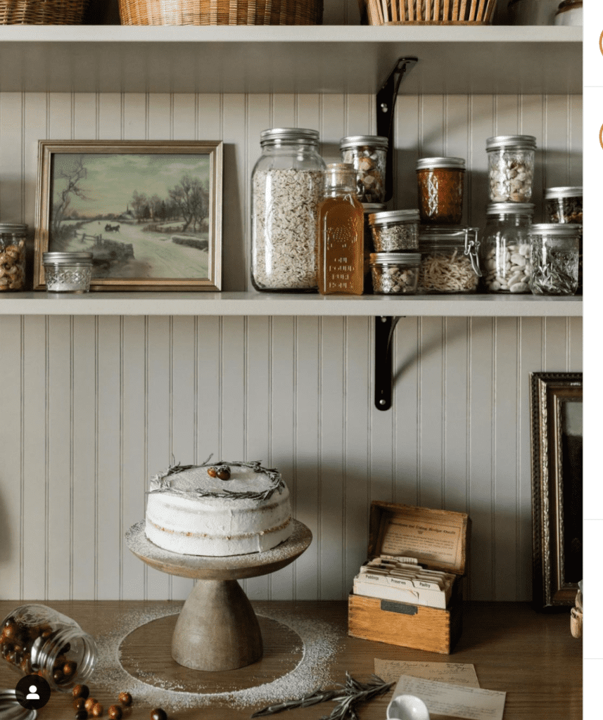
Next up, you’re going to decant everything in sight. Soaps, spices, cooking oils, ingredients, everything! If you use it and you can see it in the kitchen, put it into an aesthetically pleasing container.
Aren’t all of these consumable items so much prettier decanted into glass containers? This is definitely an easy way to make your kitchen look more expensive!
SHOP IDEAS TO DECANT ITEMS IN YOUR KITCHEN FOR THAT EXPENSIVE DESIGNER LOOK
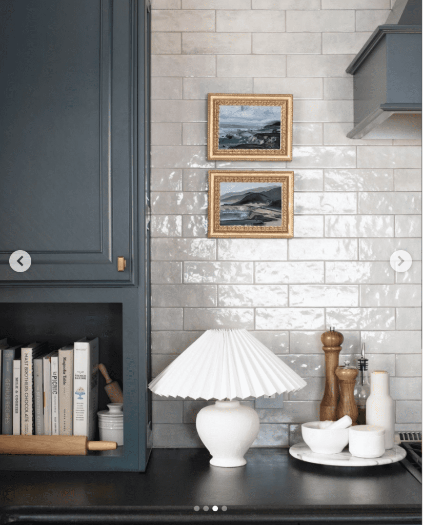
Designer Tip 4: Say YES To Art
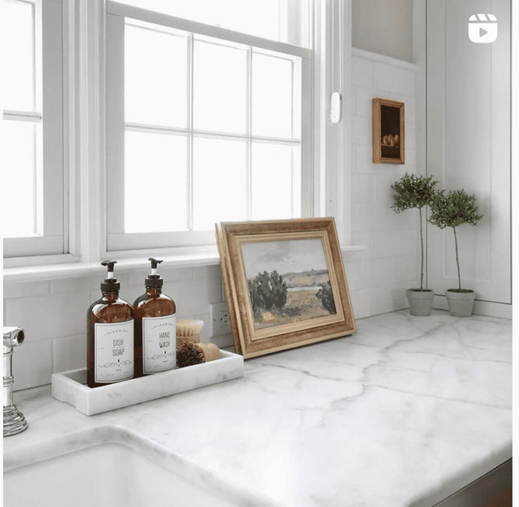
Adding artwork to the kitchen is one of my favorite designer tips to make your kitchen look more expensive!
I’m not talking about art with food or kitchen related subjects either.
In fact, for that designer look, it’s probably best that the art in your kitchen doesn’t have anything related to food at all!
It’s so hard to choose which photos to showcase artwork in the kitchen because there are so many good ones!
What kind of art is best to display in a kitchen?
Honestly, almost anything goes! As long as it’s not emblazoned with the words “EAT” or “LIVE LAUGH LOVE” or “CAFE” I’d nix the signage altogether if I had it my way.
There are far too many amazing pieces of REAL artwork to display! Don’t waste your wall space on mass produced, generic signs from the Hob Lob!
Personally, my favorite way to shop for art is to buy vintage from flea markets or Facebook Marketplace. I always keep my eyes open for original paintings/drawings secondhand because 1) it’s usually super cheap 2) it’s typically original!
Nothing compares to having an original, pre-loved piece of art even if it’s by a complete unknown artist. This will add so much character to your decor.
SHOP IDEAS FOR ART IN YOUR KITCHEN FOR THAT DESIGNER LOOK
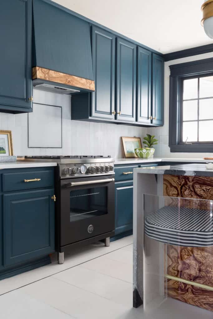
Designer Tip 5: Update Hardware
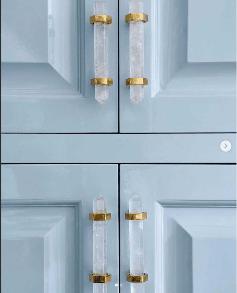
If your cabinet hardware is dragging you down, it might be time to update it to something more current. Replacing your cabinet knobs and/or pulls is a great way to make your kitchen look more expensive.
Truth be told, it CAN be expensive!
I seem to be really awesome at finding and falling in love with outrageously priced things. When we were building our last house, I somehow stumbled upon some amazingly beautiful brass pulls that were over $80/piece. It would’ve cost well over $5,000 to put pulls on our cabinets lol. Uhhh, no thanks.
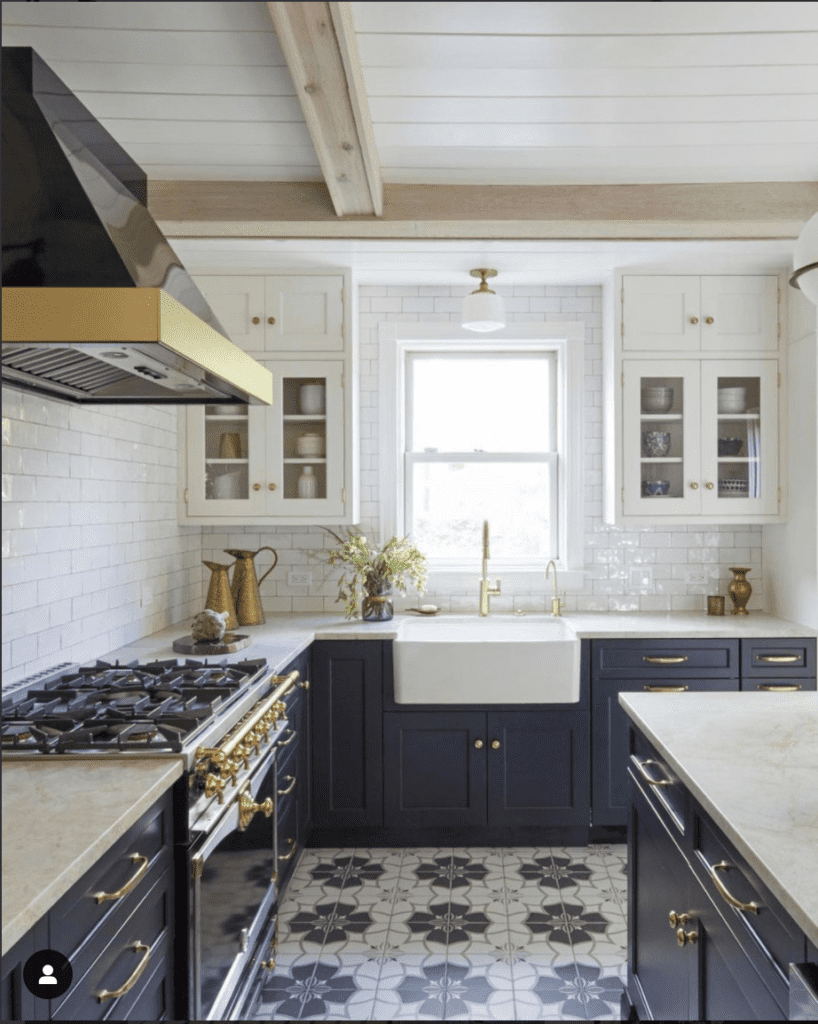
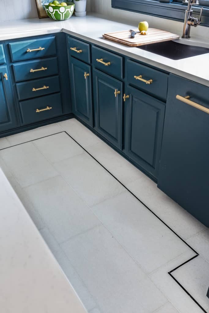
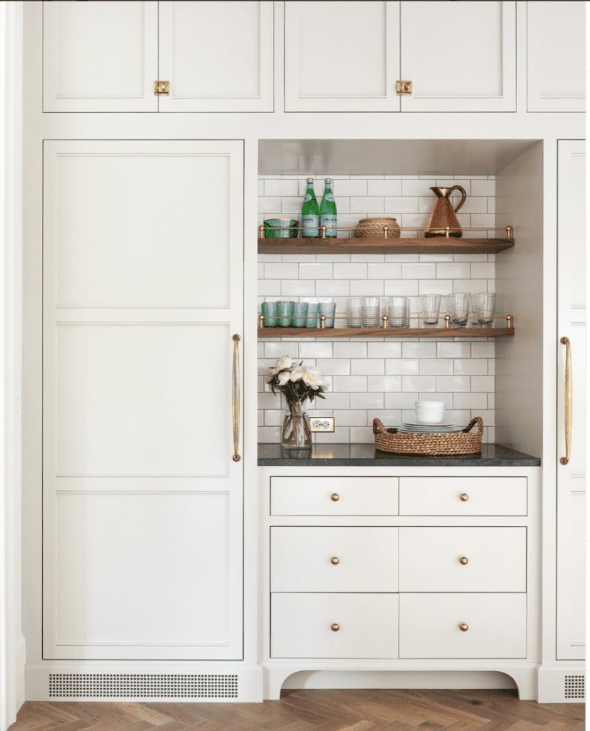
Above are three great examples of how brass hardware can lend a modern and/or classic appearance.
I especially love how W Design Collective used 3 different types of coordinating brass hardware the kitchen shown above. The drawers have a simple ball knob, the large doors have a long pull and the smaller upper doors have brass latch hardware.
Mixing multiple hardware sizes and shapes in the same finish is such a wonderful designer tip to use in your own kitchen!
SHOP HARDWARE IDEAS FOR YOUR KITCHEN FOR THAT HIGH-END LOOK
Designer Tip 6: Fresh Arrangement
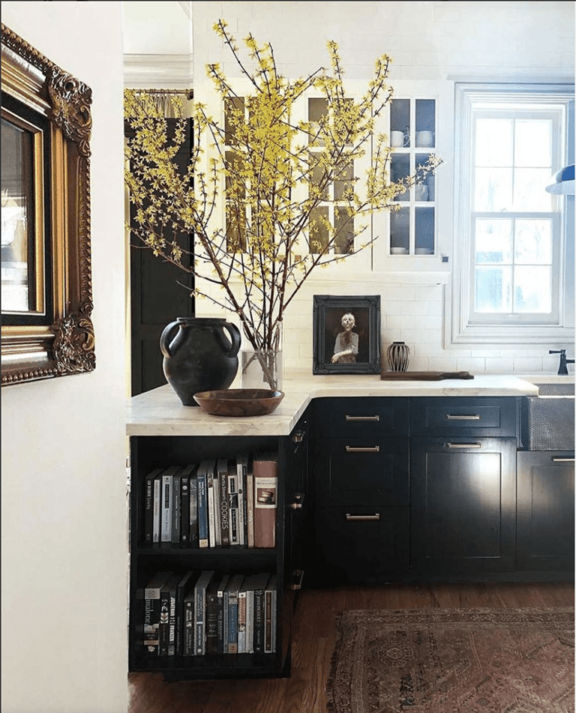
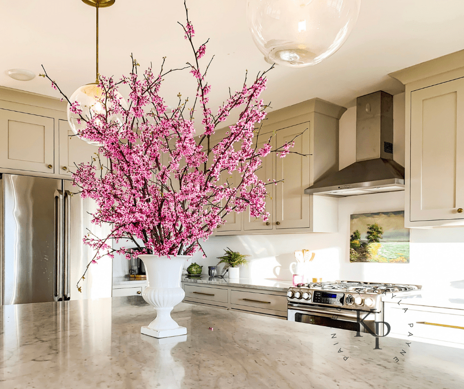
Bringing in fresh flowers, flowering shrub limbs or whole dang branches is such a designer thing to do!
While any type of fresh floral arrangement will instantly add a designer flare to your kitchen, the best kept secret is to GO BIG.
The scale of your arrangement is what will give your kitchen that expensive look you’re after. Larger the better.
Steve Cordony does this best! I swear that guy must use a chain saw for the limbs he brings inside! And the effect is stunning!
Give it a try!
Designer Tip 7: Add A Lamp
Perhaps the kitchen isn’t the first room you think of when you think of adding lamps?
That’s understandable.
However, most designers will tell you that adding a small lamp to the kitchen countertop is the right thing to do.
The ambiance and added layer of light a small kitchen lamp lends will make your kitchen look and feel more expensive. If you have room, definitely think about adding one!
SHOP FOR MINI LAMPS FOR YOUR DESIGNER KITCHEN LOOK
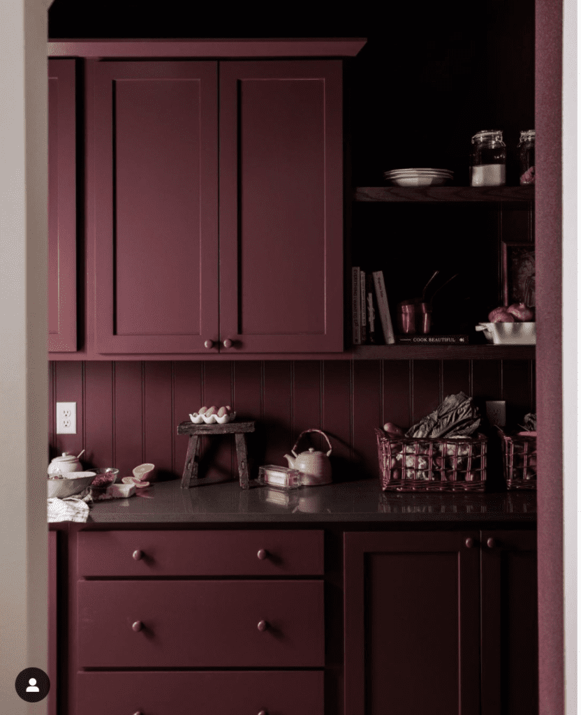
Designer Tip 8: Go Bold With Color
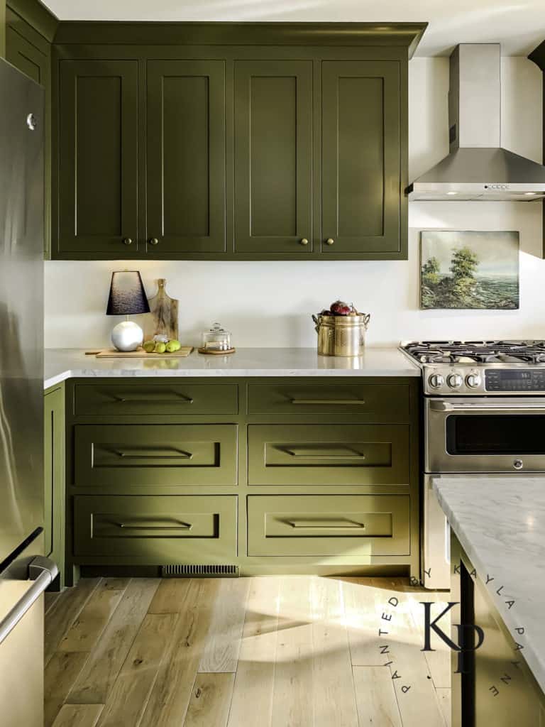
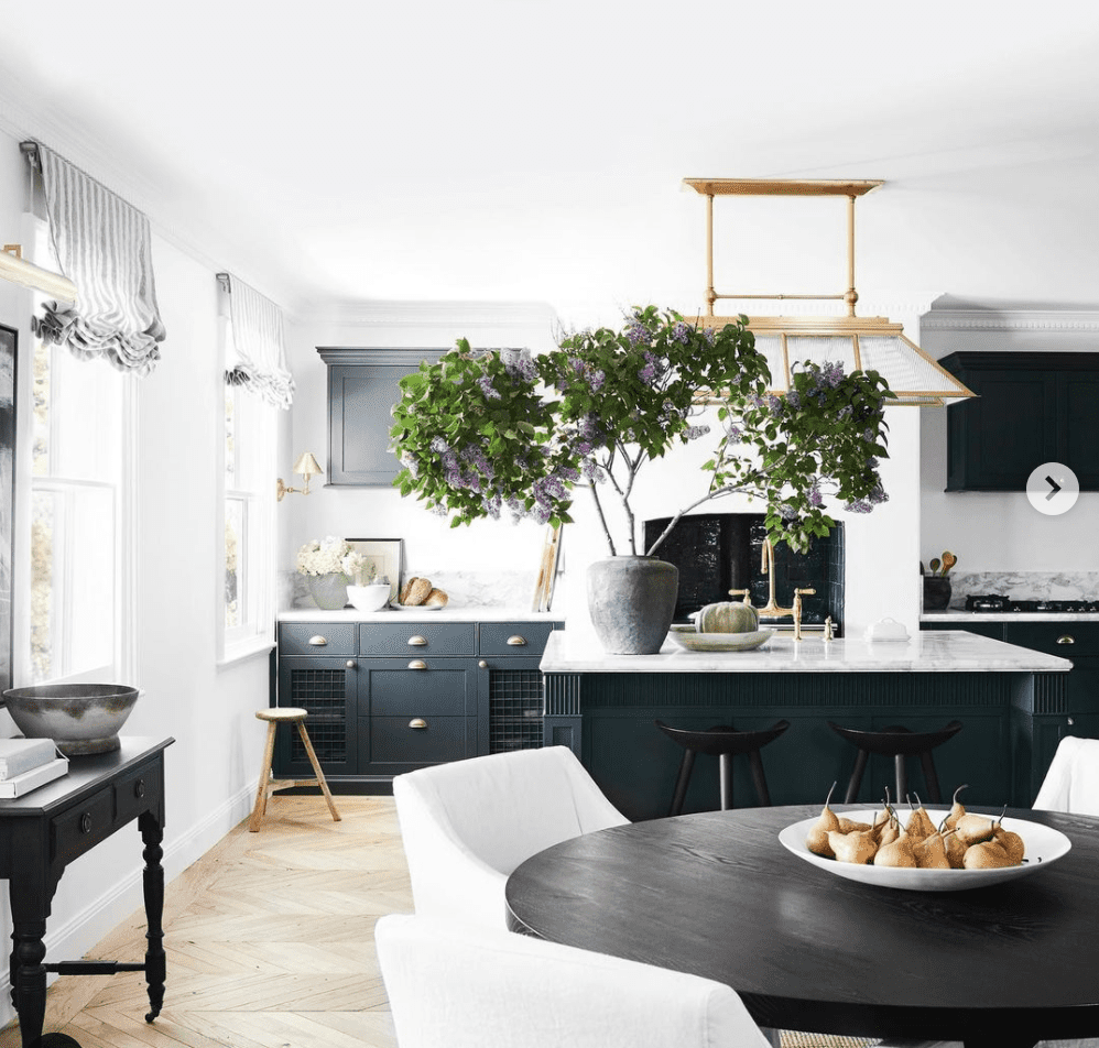
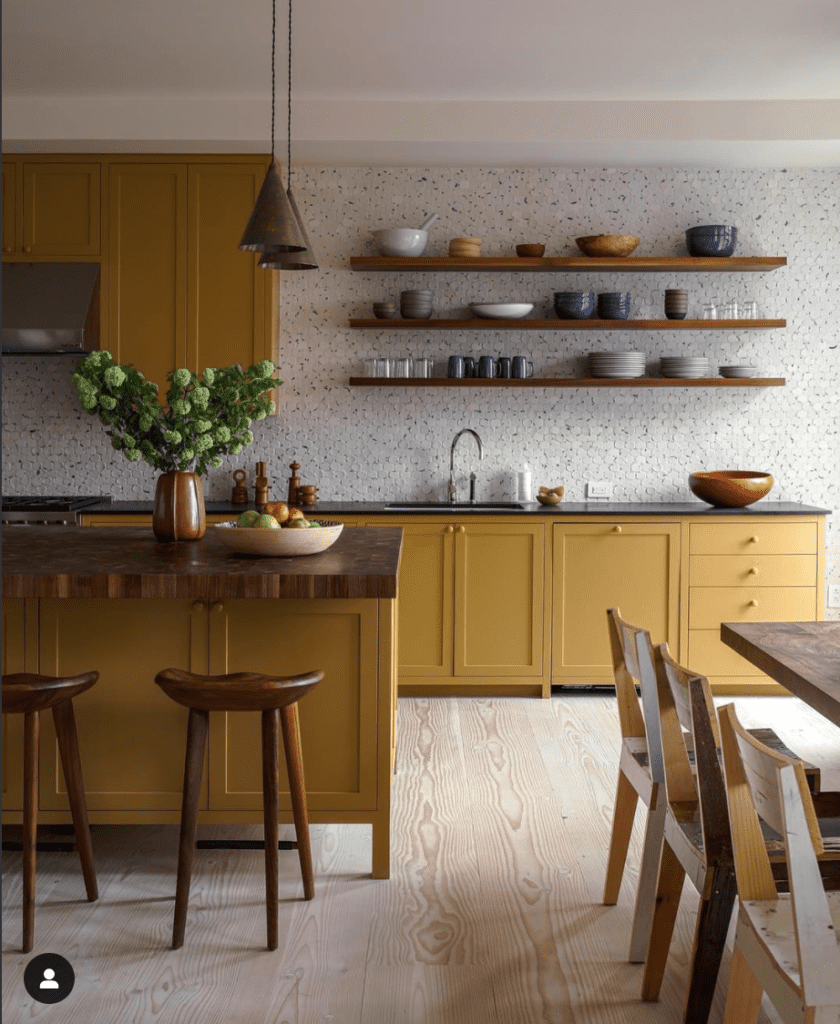
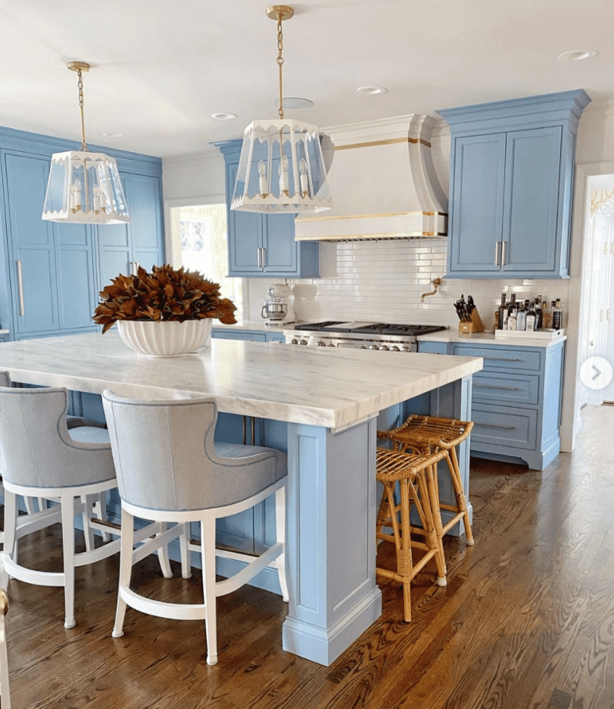
If you’re the bravest of all designer wannabe’s, consider painting your cabinets in a bold color.
(Psst…you can download the supplies you’ll need to DIY your cabinet painting here if you so decide!)
As a professional cabinet painter, I can tell you that successfully pulling off a kitchen with a bold, colorful cabinet paint color is not quite as easy as choosing the right color then calling it a day.
It’s my belief that all the other elements in the room need to be just right before your new bold cabinet color will feel and look “right”.
Luckily, if you follow these 12 designer tips to make your kitchen look more expensive, you’ll be on the right track to pulling off that cohesive look
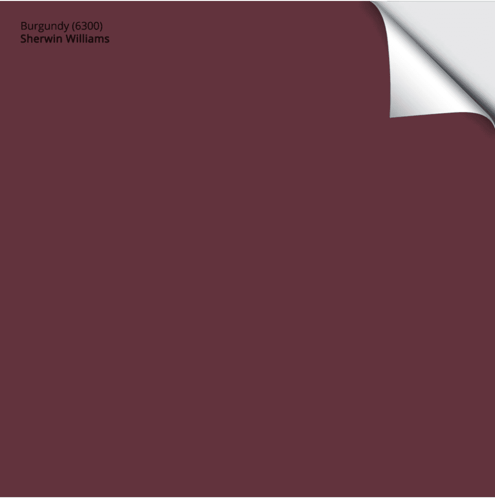
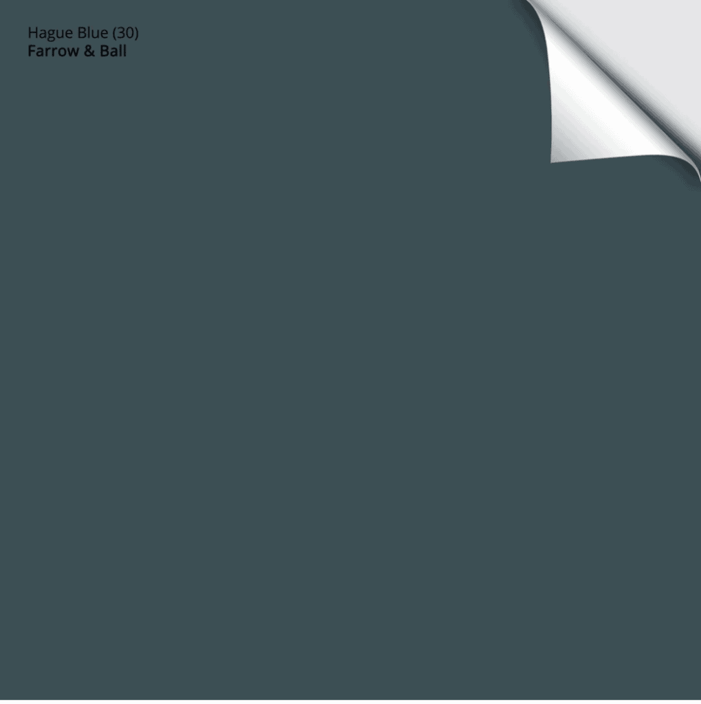
SHOP COTOUR COLOR SAMPLES TO GIVE YOUR KITCHEN CABINETS THAT DESIGNER APPEAL
Designer Tip 9: Let There Be Light
Designers know that ample amounts of light (both natural and artificial) is paramount in making the kitchen function well and look beautiful.
If your kitchen is lacking in the lighting department, you might not have many options that don’t require loads of $$$ and a full blown remodel. Therefore, maximizing what you do have will be key.
Make sure your windows aren’t hidden behind old and dated treatments. The window treatments you choose should allow as much of the window to be seen unrestricted as possible.
Using lightbulbs with the most lumens available will also make a world of difference! These are my favorite (they’re 1600 Lumens, which means they’re bright – and they’re 3000K, which means the color of light is not too yellow and NOT blue!
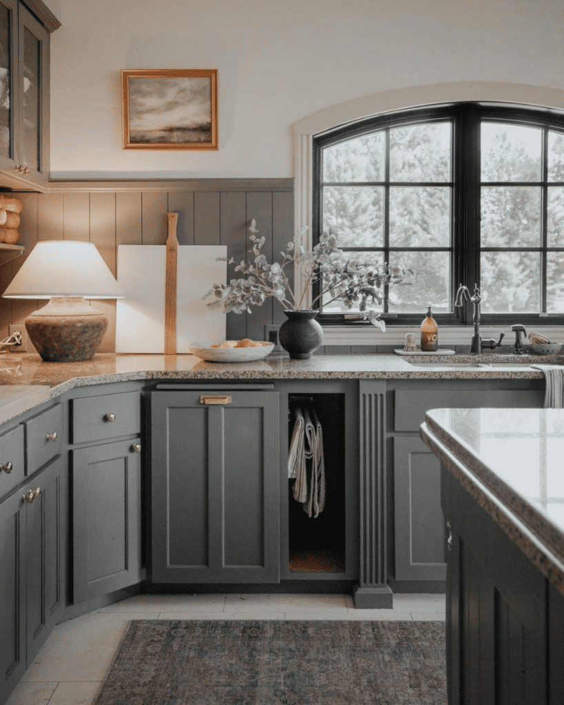
Designer Tip 10: Buy Vintage
Buying vintage decor and homewares is SUCH a great way to make your kitchen look more expensive! It takes some time and some imagination, but curating a collection of previously owned items will add character and curiosity to your home.
Plus, this is a fantastic way to save loads of money!
If you’re not someone who already knows the joy of shopping secondhand, I encourage you to drop into that flea market you’ve passed daily for years and years.
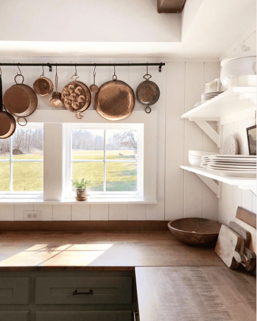
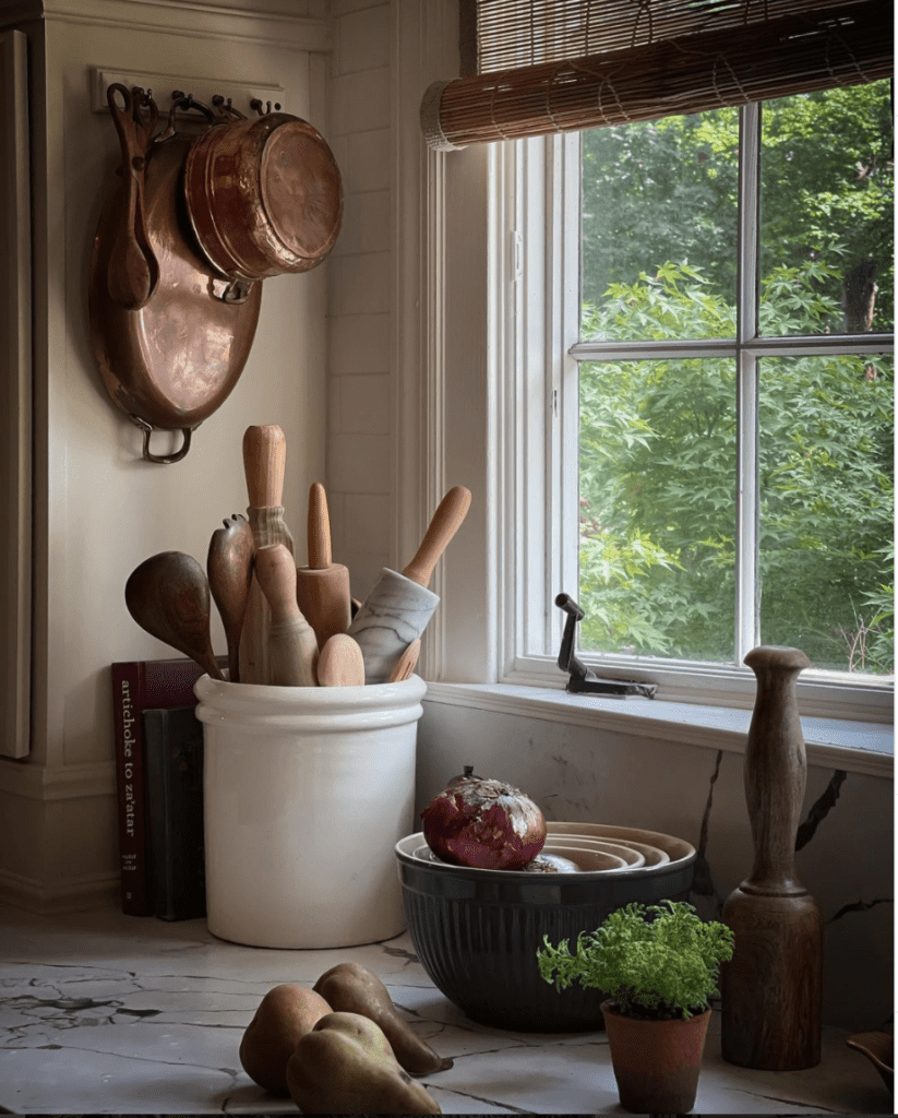
The kitchen above belongs to my internet friend, Paige Kontrafouris, and she’s an absolute master at bringing vintage decor and homewares into her home. This photo looks like a million bucks, but I guarantee you she spent very little on these items.
Sidenote: Paige also took my cabinet painting course and then painted her cabinets herself – they also look like a million bucks but cost pennies on the dollar:)
Designer Tip 11: Give It A Good Scrub
Next up on our list of making your kitchen look expensive, a good old fashioned scrubbing.
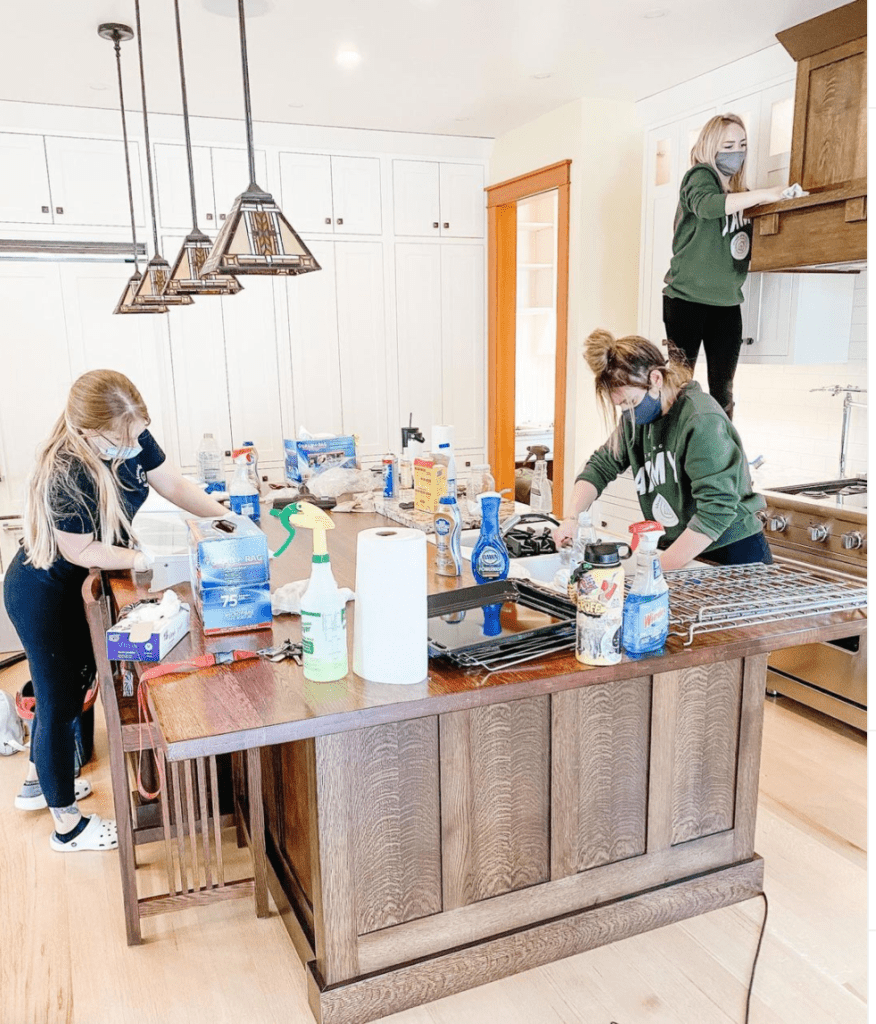
All of the designer kitchens we see on Instagram and on glossy pages of magazines have this in common, they’re perfectly spic and span.
Making your kitchen utterly spotless will instantly make it look more expensive AND make you feel really great too!
In case you’re not one of the 2.2Million followers of the enormously popular GoCleanCo, let me introduce you to the best internet rabbit hole to fall into!
Sarah, the leader of the cleaning army, has been sharing her amazing cleaning tips with the world, and somehow she’s magically giving us the motivation to clean up our own dirty houses.
I’m confident that by watching her IG stories, you’ll find yourself compelled to pull everything out of your cabinets, reorganize your crap and scrub your floors with a toothbrush. It’s crazy!
Designer Tip 12: Snap A Pic
Last but not least on our list of designer tips to make your kitchen look more expensive is an odd one, I admit. It’s kinda weird but it works!!
As you’re decorating and zhuzhing your kitchen, take out your cell phone and snap a picture. Don’t get the whole kitchen in the photo, just choose a portion of the room – like a smaller vignette.
Then look at the picture on your phone screen.
Seeing the vignette in a photo on your camera screen will give you a new perspective, and you’ll be able to arrange and style your items in a more pleasing composition.
Sarah, from Room For Tuesday, has an excellent blog post about this designer tip, HERE. She’s amazing, and if you’re not already familiar with her you’re in for a treat because you’ll love her!
There you have it, the 12 designer tips on how to make your kitchen look more expensive!
Do me a favor, if you’ve been inspired to give any of these a try, will you please send me a DM on Instagram and share with me?
You can find me @paintedbykaylapayne. I’d be thrilled to hear from you!
Until next time
xo Kayla

I would also include hiding the garbage can. Nothing decreases the esthetic of a kitchen more than when the garbage can is exposed! And if it absolutely must be out, at least spend some extra money to get a nice one with a lid that closes! GREAT post with fantastic, easy-to-implement suggestions!
That’s a GREAT addition that I did not think of!! Thanks for your input, Tristen.
xo Kayla
I loved this article! Great ideas and great visual examples to tell the story. Thanks for posting! Kris
Thanks Kris! So glad you enjoyed! xo Kayla
What a terrific post. We’re in the middle of our reno, and I can’t wait to apply so many of these when it’s finished. (BTW, yesterday it was -2 here. Today it’s 44 above. I hope the warmth heads your way.)
Thank you, Betty! Yes, the staging, decorating, zhushing part you get to do after the Reno is complete is SO FUN!!!! Excited for you!
Thinking warm thoughts for ya:) xo Kayla
Excellent advice and so do-able! I love the gorgeous photos you used as examples. I love all of Jean Stoffer’s kitchens — she ignores trends and designs the most elegant, timeless, functional, beautiful spaces. I love Chris and Julia Markham’s Idaho kitchen that you shared, too. Paint and decor go a long way!! 💗
Thank you for the excellent tips. I just had new quartz countertops installed and now I’m trying to figure out the best backsplash. I’ve already changed out my hardware. I’ll definitely find a small lamp and get a bigger floral arrangement.
Thank you so much for the great tips! Many of them have been in my toolbox for decades, but it’s great to see them itemized and discussed. I’m so excited to see so many new homeowners leaning into vintage finds – we have hardly anything “new” in our 4100 square foot home. Vintage is the key to making your home a true reflection of yourself. Thank you and I’m following you for good! Best, Melinda
Thanks Melinda! I’m like you, when I look around my home, it’s very rare that I can say, “I bought that new”….which is exactly the way I love it! So glad to have you here:) xo Kayla
Wow! This post is filled with helpful info. I devoured every tip. Well written.
Now to put some of them in place. Thank you, Kayla! Pinned. xo 😘